Let’s be real. If your website still has buttons that say “Click Here”… we need to talk. Great website design isn’t just about pretty colours and clean layouts, it’s about every tiny detail working hard for the greater good of your brand. And yep, that includes your button copy.
Because here’s the truth: your buttons are like the hype team of your website. They either cheer people on to take action, or they flop harder than a Facebook event invite.
So, let’s cancel boring button text and talk about what actually gets clicks.
Why “Click Here” Is Officially Dead
Here’s the problem with “Click Here”: it doesn’t actually say anything. It’s vague, bossy and gives zero context into what happens next. In a world where people skim-read everything, bland button text is the fastest way to lose a conversion.
Good website design is about clarity and personality. Your button copy should do more than instruct; it should entice, reassure and make sense in the bigger picture of your site.
Think about it: would you rather tap “Click Here” or “See My New Look”? Exactly.
Buttons That Actually Work
Let’s give your CTAs the glow-up they deserve. Here are some button texts that slap:
- For a booking page:
👉 “Book My Spot”
👉 “Lock It In”
👉 “I’m Ready” - For an eCommerce store:
👉 “Add to Bag”
👉 “Yes, I Need This”
👉 “Make It Mine” - For service enquiries:
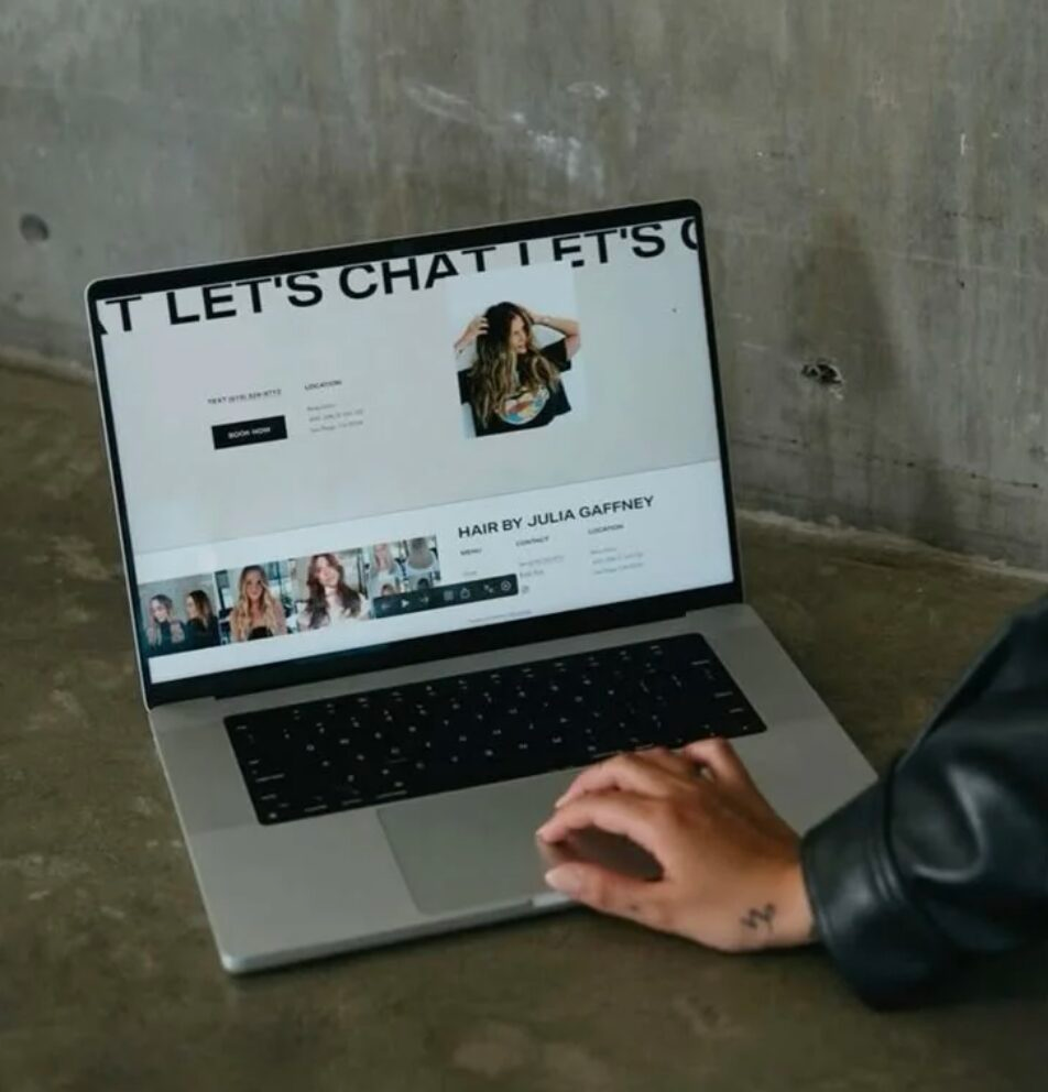
👉 “Let’s Chat”
👉 “Get My Free Quote”
👉 “Show Me How”
Notice how these don’t just say what to do – they make it feel fun, clear and a little irresistible. That’s the power of clever website design and usability.
HOT TIP: Match The Vibe
Your button text isn’t living in isolation. It’s a part of your brand voice. A sleek, minimalist brand might go with “Shop Now” clean and classic. A playful brand would say “Treat Yourself” all the way.
Consistency is key. Your audience should feel like every part of your website, from headlines to CTAs, it speaks the same language. Otherwise, it’s like mixing Vegemite with Nutella. Confusing… and ugh!
The Button Test
Here’s a fun way to check if your button text is doing its job:
- Cover the button design. Just read the text.
- Ask yourself: If I saw this in plain text, would I know what happens when I click?
- If the answer’s “ummm, maybe?” → rewrite.
Your buttons don’t need to be novels, but they do need to pull their weight. That’s what makes clever website design different from just “having a website.”
If you want to dive deeper into what makes button copy actually convert, check out this guide on effective button design from HubSpot.
https://blog.hubspot.com/website/button-design
Ready For Buttons That Convert?
If your site’s buttons are still mumbling “Click Here,” your audience is already scrolling past. Great website design sweats the small stuff, from button copy to page flow, because those details are what turn browsers into buyers.
👉 Want us to take your site from meh to magnetic? Let’s chat. Because in this day and age, basic buttons are banned and your brand deserves better.